The erplots package supplies a mini-language for generating exposure-response plots commonly used in pharmacometric analyses. It is designed to be model agnostic, in the sense that it will work for any modelling tool that implements a few key interface functions (see Implementing the model interface). It can support binary response data, continuous response data, and count response data. This article focuses on binary data, using a logistic regression model fitted using the erglm package. It covers the substantive aspects of plot construction, not the superficial features like labels, palettes, and visual theme. Those are covered by the theming exposure-response plots article, which applies unchanged regardless of response type.
Fit the model first
Unlike a plotting function that fits a model behind the scenes, erplots expects you to fit the model yourself and pass it in explicitly:
mod <- erglm_model(ae1 ~ aucss, erglm_data, family = binomial())Defining plots
Basic usage
erglm_data |>
  er_plot(exposure = aucss, response = ae1) |>
  er_plot_add_model(mod) |>
  er_plot_add_quantiles() |>
  plot()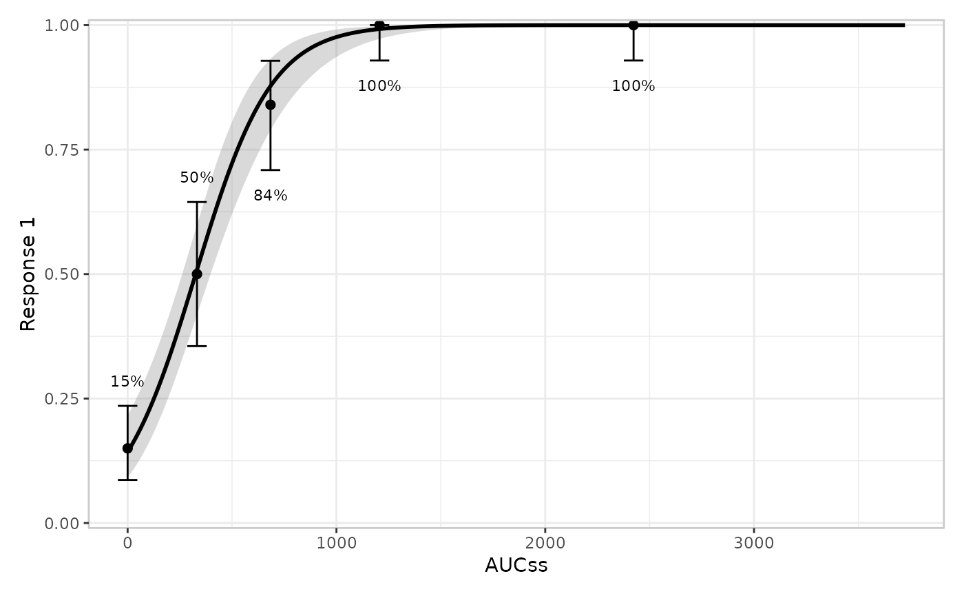
Adding extra layers
erglm_data |>
  er_plot(exposure = aucss, response = ae1) |>
  er_plot_add_model(mod) |>
  er_plot_add_quantiles() |>
  er_plot_add_data() |>
  er_plot_add_groups(group_by = aucss) |>
  plot()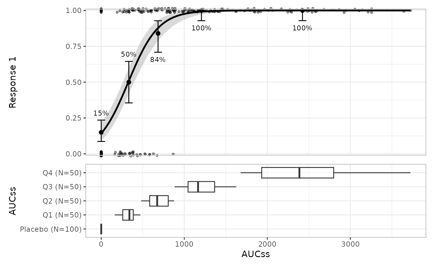
Stratification
Stratification adds colour across all layers. This requires a model that includes the stratification variable as a term:
mod_strat <- erglm_model(ae1 ~ aucss + sex, erglm_data, family = binomial())

erglm_data |>
  er_plot(
    exposure = aucss,
    response = ae1,
    stratify_by = sex
  ) |>
  er_plot_add_model(mod_strat) |>
  er_plot_add_quantiles() |>
  er_plot_add_data() |>
  plot()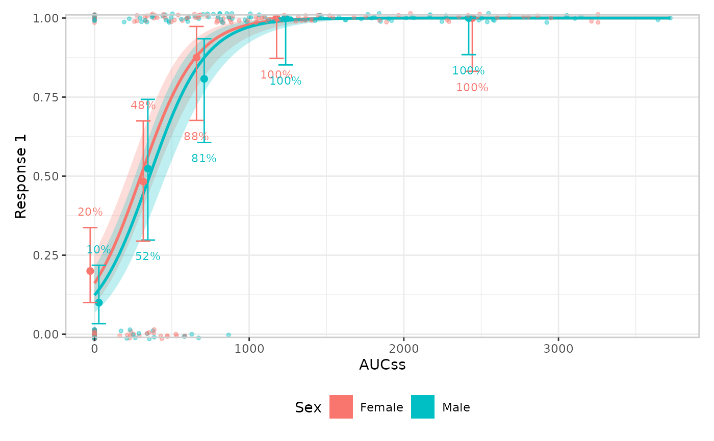
You can suppress stratification for specific layers
erglm_data |>
  er_plot(
    exposure = aucss,
    response = ae1,
    stratify_by = sex
  ) |>
  # keep_strata = FALSE needs a model that doesn't include the
  # stratification variable, so we pass the un-stratified `mod` here
  er_plot_add_model(mod, keep_strata = FALSE) |>
  er_plot_add_quantiles() |>
  er_plot_add_data() |>
  plot()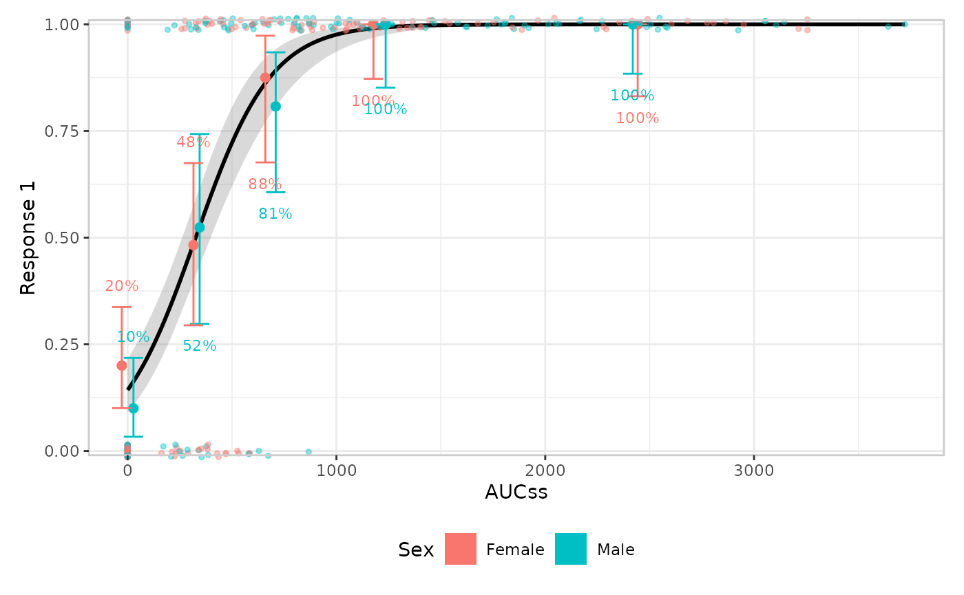
Model layer
The default builder is er_style_model_ribbonline(), but
you can also draw spaghetti plots to represent parameter uncertainty
with er_style_model_spaghetti(). Spaghetti plots require
the model to implement er_simulate() (erglm’s models do);
models that only implement er_predict() fall back to
er_style_model_ribbonline() with a message. This layer
doesn’t look at response_type at all – it only consumes
er_predict()/er_simulate() output – so
everything in this section applies unchanged to continuous and count
responses too.
erglm_data |>
  er_plot(aucss, ae1) |>
  er_plot_add_model(mod, style = "spaghetti") |>
  er_plot_add_quantiles() |>
  plot()
#> Using seed = 7040. Pass `seed = 7040` to reproduce this result.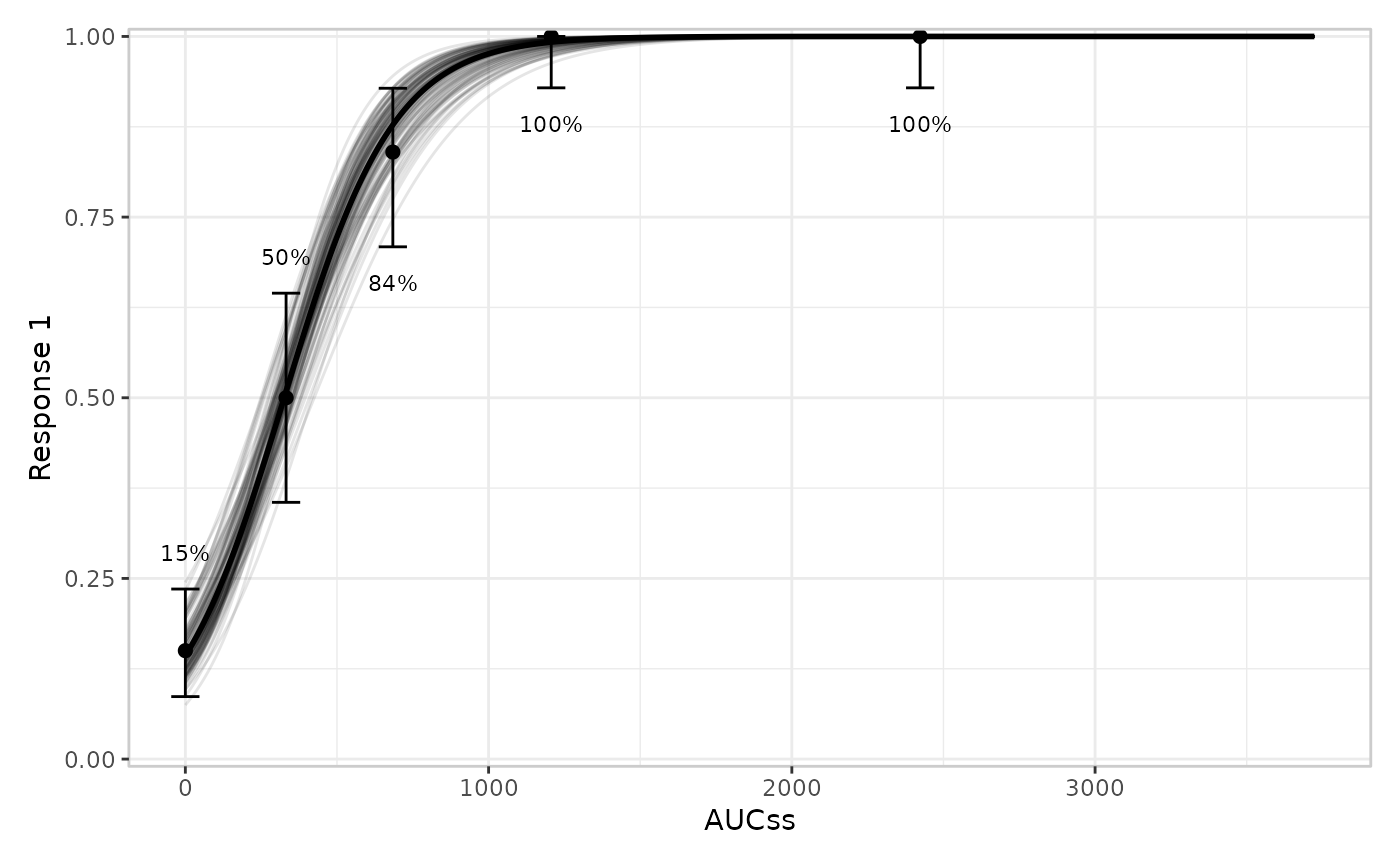
Summary layer
er_plot_add_summary() annotates the base panel with a
statistic derived from the model (or, for
er_style_summary_n(), purely descriptive of the raw data) –
see Implementing the model interface
for what a model’s own er_summary() method can return. The
default builder, er_style_summary_pvalue(), draws whatever
headline p-value the model reports, in whichever corner is furthest from
the observed data:
erglm_data |>
  er_plot(aucss, ae1) |>
  er_plot_add_model(mod) |>
  er_plot_add_summary(model = mod) |>
  plot()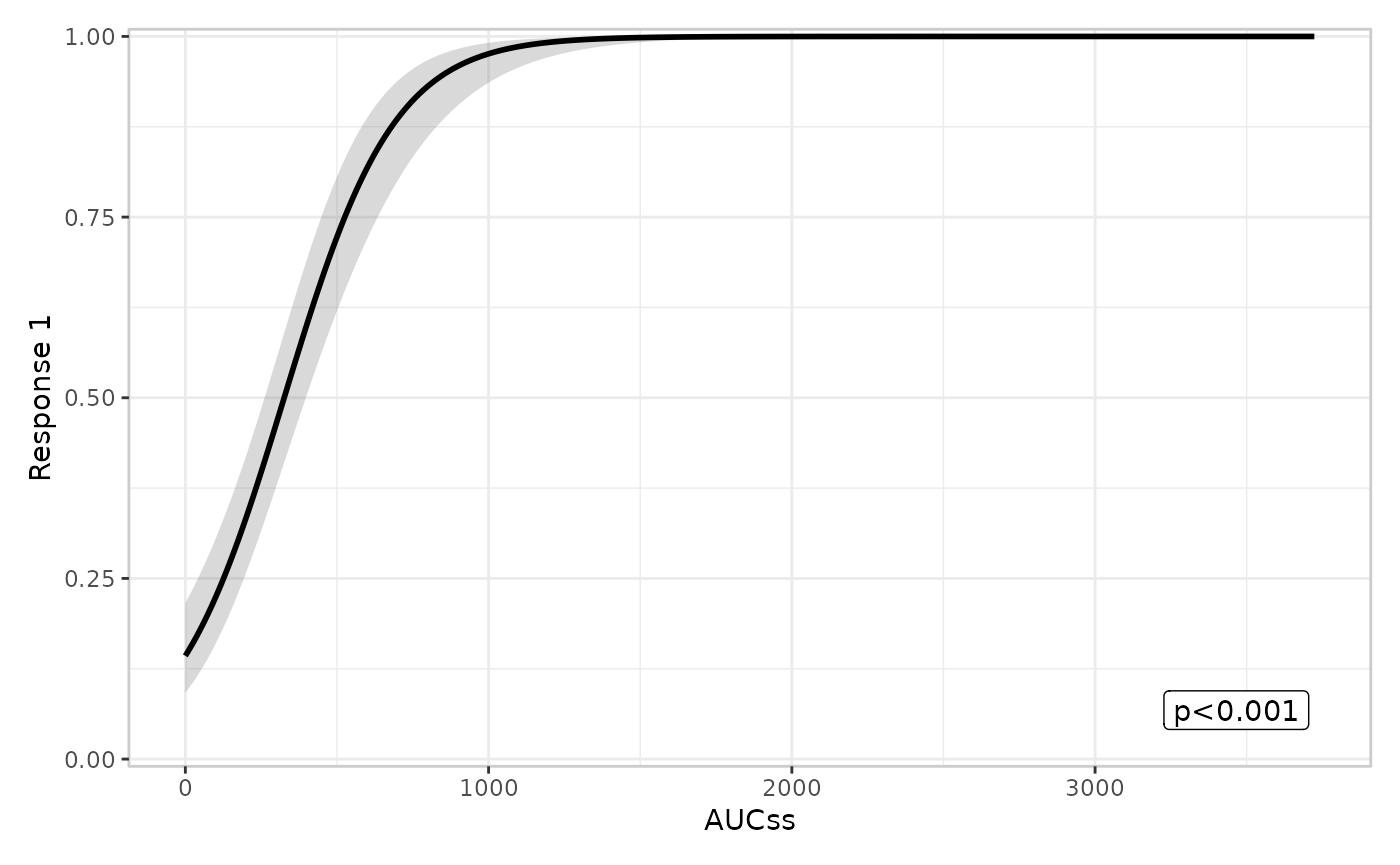
er_style_summary_gof() draws a different kind of
annotation – goodness-of-fit rather than a p-value – built from a
curated, compact subset of er_summary()’s
glance field (N, AIC,
BIC, R², whichever are present and
non-NA). erglm’s own er_summary() method
already populates glance (alongside p_value
and coefficients), so no extra setup is needed here:
erglm_data |>
  er_plot(aucss, ae1) |>
  er_plot_add_model(mod) |>
  er_plot_add_summary(model = mod, style = "gof") |>
  plot()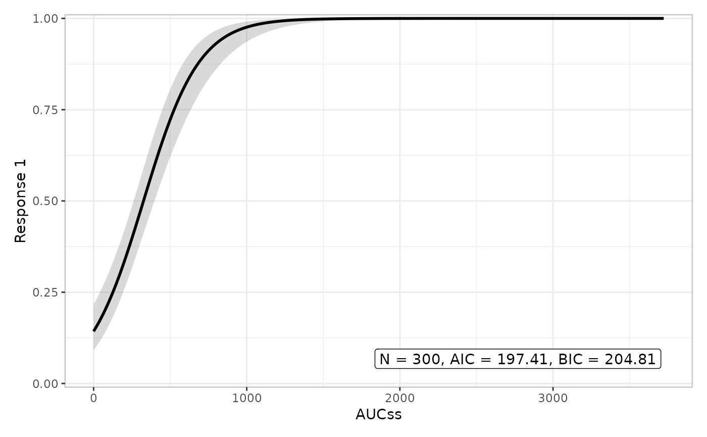
er_style_summary_coefficients() (one line per model
parameter, for models with no single privileged p-value) and
er_style_summary_n() (a model-agnostic observation count)
are two further builders for this layer – see
?er_style_summary for all four.
Quantile layer
You can modify the number of bins:
erglm_data |>
  er_plot(aucss, ae1) |>
  er_plot_add_model(mod) |>
  er_plot_add_quantiles(n_bins = 6) |>
  plot()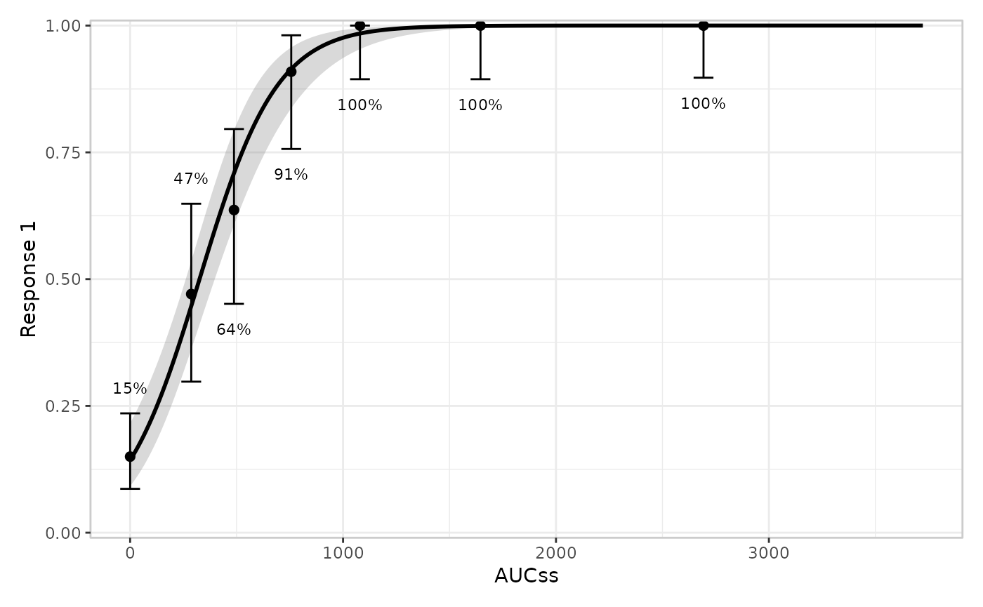
You can also modify the confidence level for the interval around each bin’s summary. For a binary response this is a Clopper-Pearson interval for the response rate; see the continuous and count articles for how this layer adapts its summary statistic and interval method to those response types.
erglm_data |>
  er_plot(aucss, ae1) |>
  er_plot_add_model(mod) |>
  er_plot_add_quantiles(n_bins = 6, conf_level = .8) |>
  plot()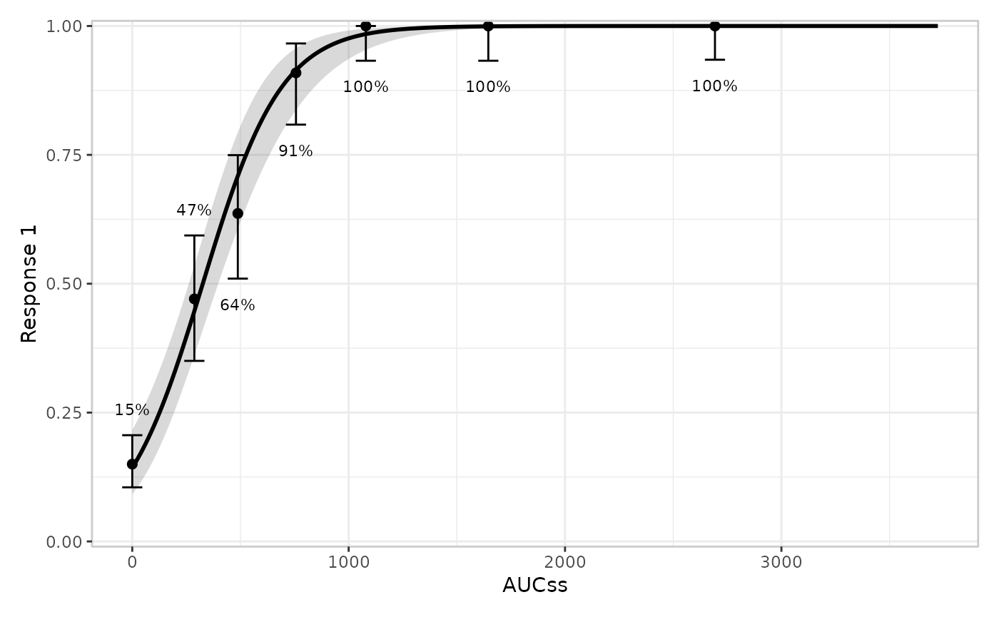
Data layer
er_plot_add_data() adds the raw observations. By default
(er_style_data_overlay()), points are drawn at their true
(exposure, response) coordinates in the main model
panel – for a binary response this is a scatter with a small vertical
jitter, since the y-values are exactly 0/1 and would otherwise overplot
into two solid lines:
erglm_data |>
  er_plot(aucss, ae1) |>
  er_plot_add_model(mod) |>
  er_plot_add_quantiles() |>
  er_plot_add_data() |>
  plot()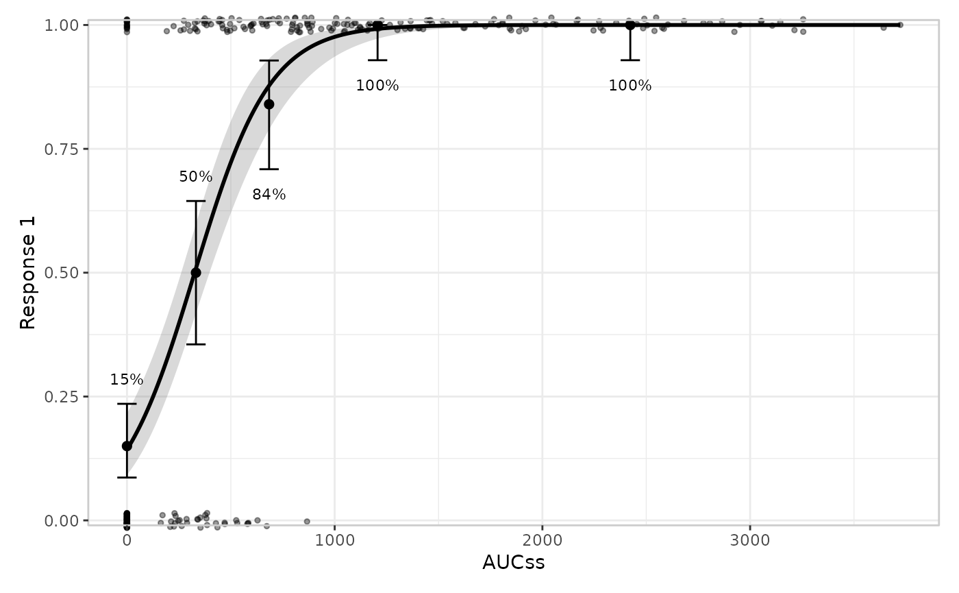
er_style_data_overlay()
vs. er_style_data_boxjitter()
er_style_data_boxjitter() is a panel-based design, and
is binary-response only: it splits responders/non-responders into
separate panels above/below the main plot, each showing a boxplot of the
exposure values with the raw jittered points layered on top – so the
panel shows the exposure distribution conditional on response,
not just individual points. There is no built-in panel-based builder for
a continuous/count response; er_style_data_overlay() (raw
points at their true (exposure, response) coordinates,
shown in the continuous
and count articles) covers that
case there, as does er_style_data_hex() (a 2D hexbin
density overlay, also usable for a binary response – see
?er_style_data), and a custom "panel"-layout
builder (e.g. a single colour-encoded panel) remains possible via
er_style_tag() if a project needs one – see the Extending erplots article. Each builder
declares which of the two structural families it belongs to via
er_style_tag(), which is what
er_plot_add_data() uses to decide whether to merge it into
the main panel or stack it in panels below.
Building both side by side (via patchwork’s | operator)
makes the difference concrete:
p_overlay <- erglm_data |>
  er_plot(aucss, ae1) |>
  er_plot_add_model(mod) |>
  er_plot_add_quantiles() |>
  er_plot_add_data() |>
  er_plot_build()

p_boxjitter <- erglm_data |>
  er_plot(aucss, ae1) |>
  er_plot_add_model(mod) |>
  er_plot_add_quantiles() |>
  er_plot_add_data(style = "boxjitter") |>
  er_plot_build()

p_overlay$output | p_boxjitter$output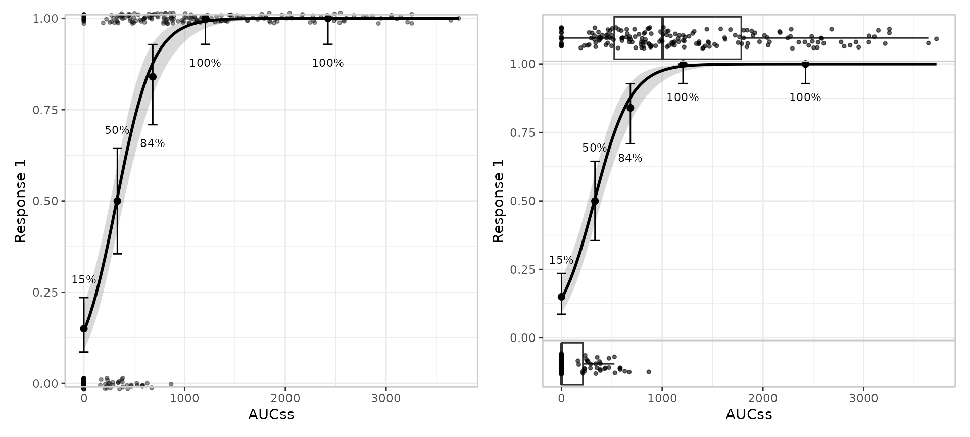
Stratification looks the same for both: colour/fill always means
strata for er_style_data_boxjitter(), sharing the model
curve’s own legend, the same way er_style_data_overlay()’s
colour aesthetic does for any response type:
p_overlay_strat <- erglm_data |>
  er_plot(aucss, ae1, stratify_by = sex) |>
  er_plot_add_model(mod_strat) |>
  er_plot_add_data() |>
  er_plot_build()

p_boxjitter_strat <- erglm_data |>
  er_plot(aucss, ae1, stratify_by = sex) |>
  er_plot_add_model(mod_strat) |>
  er_plot_add_data(style = "boxjitter") |>
  er_plot_build()

p_overlay_strat$output | p_boxjitter_strat$output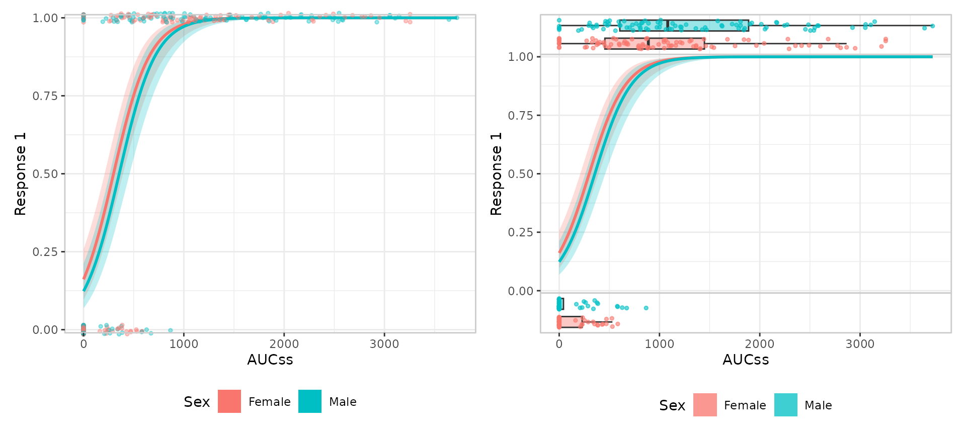
Group layer
Multiple grouping variables are allowed. Like the model layer, this
layer doesn’t look at response_type at all – it only
consumes the exposure variable – so everything in this section applies
unchanged to continuous and count responses too.
erglm_data |>
  er_plot(aucss, ae1) |>
  er_plot_add_model(mod) |>
  er_plot_add_quantiles() |>
  er_plot_add_groups(group_by = c(aucss, sex)) |>
  plot()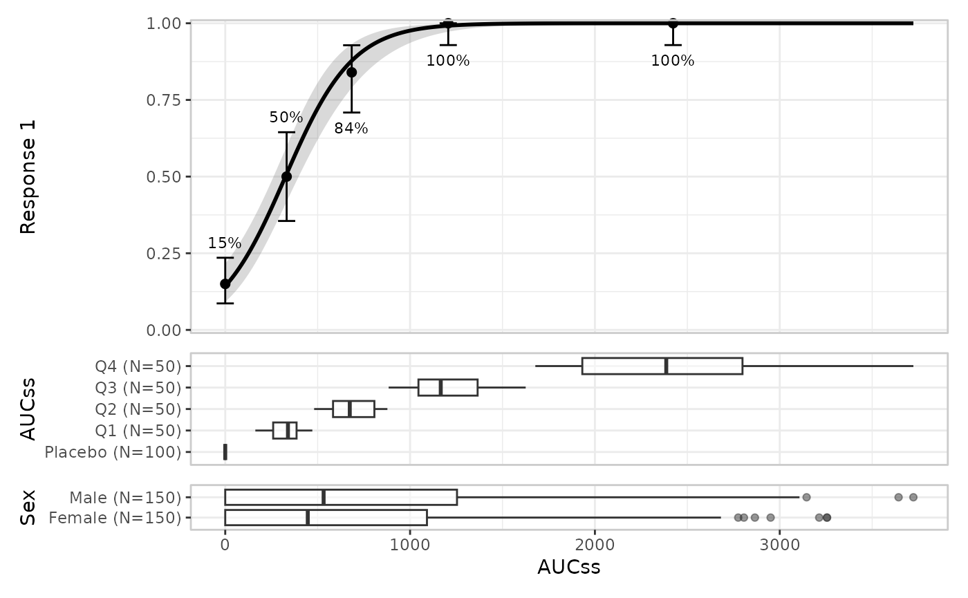
Stratification propagates to the group layer:
erglm_data |>
  er_plot(aucss, ae1, stratify_by = sex) |>
  er_plot_add_model(mod_strat) |>
  er_plot_add_quantiles() |>
  er_plot_add_groups(group_by = aucss) |>
  plot()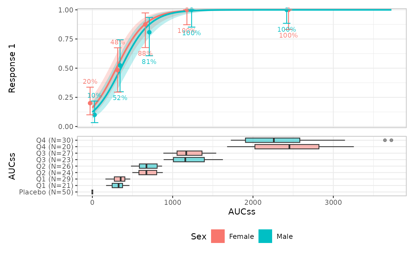
The default builder is er_style_group_boxplot(), but you
can also use violin plots with er_style_group_violin():
erglm_data |>
  er_plot(aucss, ae1) |>
  er_plot_add_model(mod) |>
  er_plot_add_quantiles() |>
  er_plot_add_groups(group_by = sex, style = "violin") |>
  plot()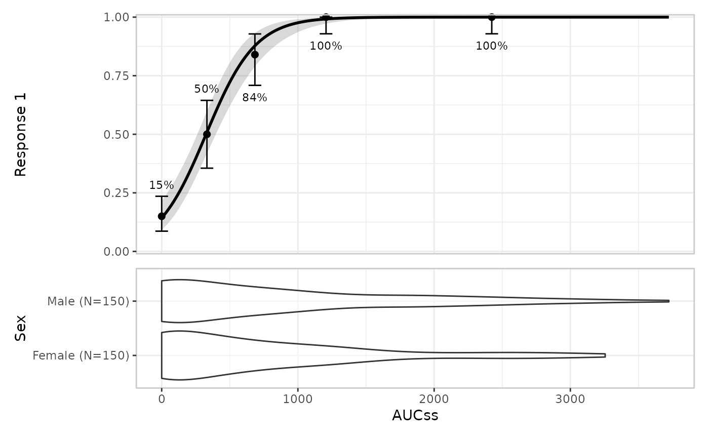
A handful of further group builders round out the set:
er_style_group_histogram() puts counts on the y-axis
instead of the group variable itself,
er_style_group_linerange() draws a minimal range instead of
a full box/violin shape, and er_style_group_boxjitter()/
er_style_group_violinjitter() overlay the raw jittered
exposure values on top of the boxplot/violin shape – see
?er_style_group for the full list.